Coconut in every scoop. Personality in every corner. A tiny café, designed to feel like a tropical break.
This wasn’t just a café project. It was our first.
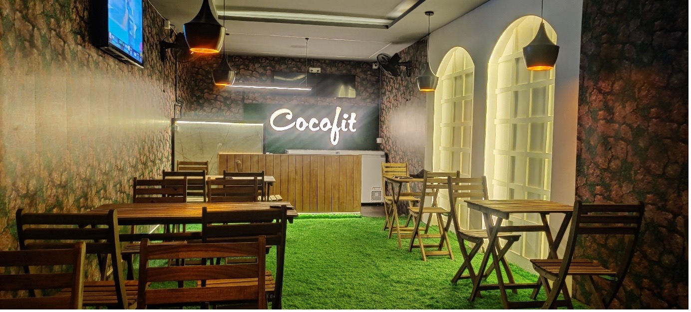
A blank rental box in became a coconut-inspired dessert spot — with ice creams, shakes, and chilled stories served in tender coconut shells.
The client? A friend. The deadline? 15 days. The result? A space that smells like cold desserts, feels like a green escape, and photographs beautifully from every angle.


From Bare Shell to Three Zones
From Bare Shell to Three Zones
The site was literally empty — just walls and a false ceiling.
We broke the layout into three distinct zones:
- Kitchen – efficient, storage-friendly, and clean
- Reception + Stone Cold Prep Counter – a visual magnet
- Seating Area – relaxed, fun, green, and selfie-ready
The brand gave us one mandate: include their signature coconut-and-leaf wallpaper.
The rest? Was open to interpretation — and we took full advantage.


Designing for a Coconut Brand
To stay true to the coconut-first identity, we wrapped the interiors in greens, textures, and tropical cues:
- Flooring: Artificial turf to mimic garden freshness
- Walls: Tropical leaf wallpaper as a visual anchor
- Lights: Hanging pendants + indirect ambient lighting
- Planters: IKEA-sourced greens in all corners for a soft, vibrant glow
The result? A space that feels naturally chilled — like a coconut itself.


The Photo Niche That Became a Landmark
One of the best visual hacks in this project came from an existing niche in the wall. Instead of ignoring it, we turned it into a feature:
- Framed it with 2 soft arches
- Added horizontal + vertical wood strips
- Installed ambient lights
- Turned it into a built-in photo booth that everyone uses now
This wasn’t just design — it was marketing.


Reception as a Performance Zone
The stone-cold ice cream counter was placed beside reception — not randomly, but strategically. Watching the cold prep is half the fun, especially for kids. We planned a minimalist reception counter in front of a backlit CocoFit logo wall with acrylic cut letters and clean branding.

On a Budget, With a Clock Ticking
Everything in this project was budget-sensitive. So we hacked the process:
- Partition Wall with Camouflage Door to hide kitchen
- Minimal ceiling tweaks to avoid waste
- Furniture sourcing from trusted vendors + local markets
- Decorative lights sourced from Chickpet & BVK Iyengar Road in a one-day design trip
- Nameboard: Backlit acrylic sign — simple, clear, impactful
- Planters, decor & accents: IKEA, cost-effective but aesthetic


Start to Finish in 15 Days
Painting, electricals, carpentry, sourcing, styling — we wrapped it all in just 2 weeks.
The evening before launch, we were still on ladders adjusting pendant heights, wiping glass, and placing plants.
The next day?
Customers walked in. The brand team smiled. And our first project got more Google reviews for its ambience than the food itself.


What This Project Meant to Us
You never forget your first coconut.
We learned how to balance speed, budget, branding, and beauty — all in one tight layout.
It’s where we proved that small projects can have big impact — with the right design mind behind them.